
Queue management systems record every transaction from day one. VelocityNex Foundational Reporting turns that data into five live dashboards — no minimum data history, live in 30 days.
Most operations managers know their average wait time. Few know their P90. Fewer still can compare service delivery across branches, by service type, over a rolling quarter, without exporting data and building their own view to do it.
That gap is not a data problem. Your queue system has been collecting that information since implementation day. It's a presentation problem.
That's what we built Foundational Reporting to solve.
Queue management systems record every transaction from day one, but their standard canned reports are built for real-time operations, not retrospective analysis. Most teams are filling that gap manually, exporting data and reconciling it across branches on their own. Foundational Reporting is a done-for-you alternative: five dashboards built on your existing Orchestra data, live within 30 days, with no new hardware and no minimum data history required.
What Queue System Reports Do (and Where They Stop)
Queue management systems come with built-in reporting. Most of those reports are designed for real-time operations: keeping queues moving, keeping staff informed, giving supervisors a view of what's happening right now. The standard canned report captures a snapshot of what happened. It does that well.
What it was not designed to do is the analysis that comes after: How do my branches compare this month? Which services are falling behind? What does the trend look like over the last quarter? You can get there with most systems' native exports, but you are doing the work. Exporting data, building your own views, reconciling numbers across branches.
If that works for you, that's fine. Some teams do it that way. For everyone else, we built a done-for-you version.
What "Done For You" Actually Means
Your data is automatically pulled, cleaned, and processed. Invalid records are removed. Incomplete transactions are handled. What appears in the dashboards is accurate.
The dashboards update on a regular refresh cycle. You don't pull a report. You open a dashboard. Five views of your operation, built, maintained, and supported by VelocityNex. Available in English or Spanish. 30 days from agreement to go-live.
Two things you need on your side:
DataConnect from Qmatic.
That's the bridge we use to access your existing data. No new hardware, no changes to Orchestra.
Your data, however much you have.
This is the one thing that makes Foundational Reporting different from everything else we offer. You don't need years of history to start. A brand new agency that just went live on Orchestra can use these dashboards from day one. An agency that has been running Orchestra for a decade can use them too. Both get the same five dashboards. The only difference is how far back the date filter goes.
That's intentional. Every other tier in our stack requires a minimum data history — six months, a year, two years — before the analysis is meaningful. Foundational Reporting has no minimum. You start where you are.
The Five Dashboards
Queue Summary
You stop managing by instinct and start managing by evidence.
Every branch, every queue, every service in one screen. Filter by date range, by location, by service type. Compare this week to last month. See average wait time and P90 wait time side by side, so you know what most customers actually experienced — not just the middle of the distribution. See which queues are hitting your service level target and which aren't.
This is the dashboard managers open daily, monthly, and quarterly. It answers the first question every director asks: how are we doing?
Service Summary
You can justify staffing decisions by service, not just by branch.
Different services carry different loads. Some take longer. Some are growing. Some are concentrated at specific locations. This dashboard breaks performance down by service type across all your branches: volume, delivery time, throughput. When you need to make a case for resource allocation, this is where the numbers come from.
Appointment Booking
You stop being surprised by what shows up and start planning for it.
Scheduled appointments and walk-in customers move through your operation differently. This dashboard separates them. No-show rates by service and branch. Booking lead times. Where appointment volume is growing or shrinking. If you manage both types of traffic in the same space, this dashboard shows you exactly what proportion of each is arriving and when.
Customer Feedback
You know where the service experience is breaking down before it becomes a public complaint.
Satisfaction scores by branch and queue, tied directly to where the experience happened. Not a single average across everything. Broken down so you can see which services are driving negative feedback, whether scores are improving or declining over time, and how different locations compare when serving similar populations.
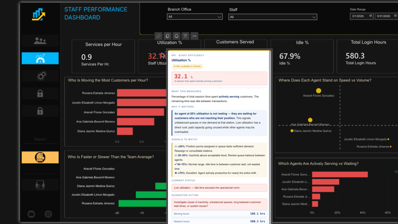
Staff Performance
You can see where the workload is uneven without relying on what managers tell you.
Sessions logged per staff member, customers served, no-show counts, average transaction duration, and inactivity rates by branch across a date range you define. This is a workload accounting view, not a performance review. It shows you who is carrying the load and where session time is sitting unproductive. When inactivity rates are high or transaction counts are uneven across staff, you have the data to ask the right questions.
Who This Is For
If your agency is running Orchestra and using the built-in canned reports, this was built for you. You don't need a data team. You don't need prior experience with analytics. You don't need to change how Orchestra runs.
You need DataConnect. We handle everything else.
The Data Has Always Been There
Every visit, every transaction, every service interaction. Orchestra has been collecting it. VelocityNex takes that data, cleans it, and puts it into dashboards your team can actually use.
Want to see what your data looks like? We'll build your Foundational Reporting dashboards on your actual Orchestra data. No synthetic demos. No generic screenshots. Your operation.